
(In short)
- A streetwear logo has to work on fabric first: screen prints, embroidery, woven labels and hang tags.
- Most strong clothing brands use a small logo system, not one logo: a wordmark, a symbol or monogram and a tiny mark.
- Start from the scene you come from, avoid the obvious clichés and test every mark on real products before you sign it off.
A streetwear logo is the most worn piece of graphic design a clothing brand will ever make. It ends up on chests, caps, neck labels, zipper pulls, mailer bags and tiny social avatars, and it has to feel right to a crowd that can spot anything fake from across the street.
I've designed logos and identities for fashion, music and culture brands for more than 13 years, including the wordmark and monogram for the Los Angeles streetwear label Capri. This guide is the process I follow when a new label asks me to design its clothing brand logo, and the production details most guides skip.
What makes a streetwear logo different
A tech logo lives mostly on screens. A streetwear logo lives on fabric. That changes everything:
- It gets printed, stitched and woven. Screen prints crack, embroidery loses fine detail and woven labels have a coarse grid. Thin lines and tiny counters disappear.
- It's part of the product. People buy the hoodie partly because of the mark on it. If nobody would wear your logo, it isn't finished.
- It has to carry culture. The type, shape and attitude need to mean something to the people you dress, not just look trendy.
- It needs to repeat without getting boring. Every drop needs something new, so the logo has to sit inside a system with room to move.
The labels that lasted understood this early. Stüssy's script started as Shawn Stussy's own signature on his surfboards, and Supreme's red box logo borrowed directly from the visual language of artist Barbara Kruger. Both marks became famous because they stood for a scene, then got repeated until they were unmistakable.
The four types of streetwear logo
Most clothing brand logos fall into four families. Many brands use two or three of them together.
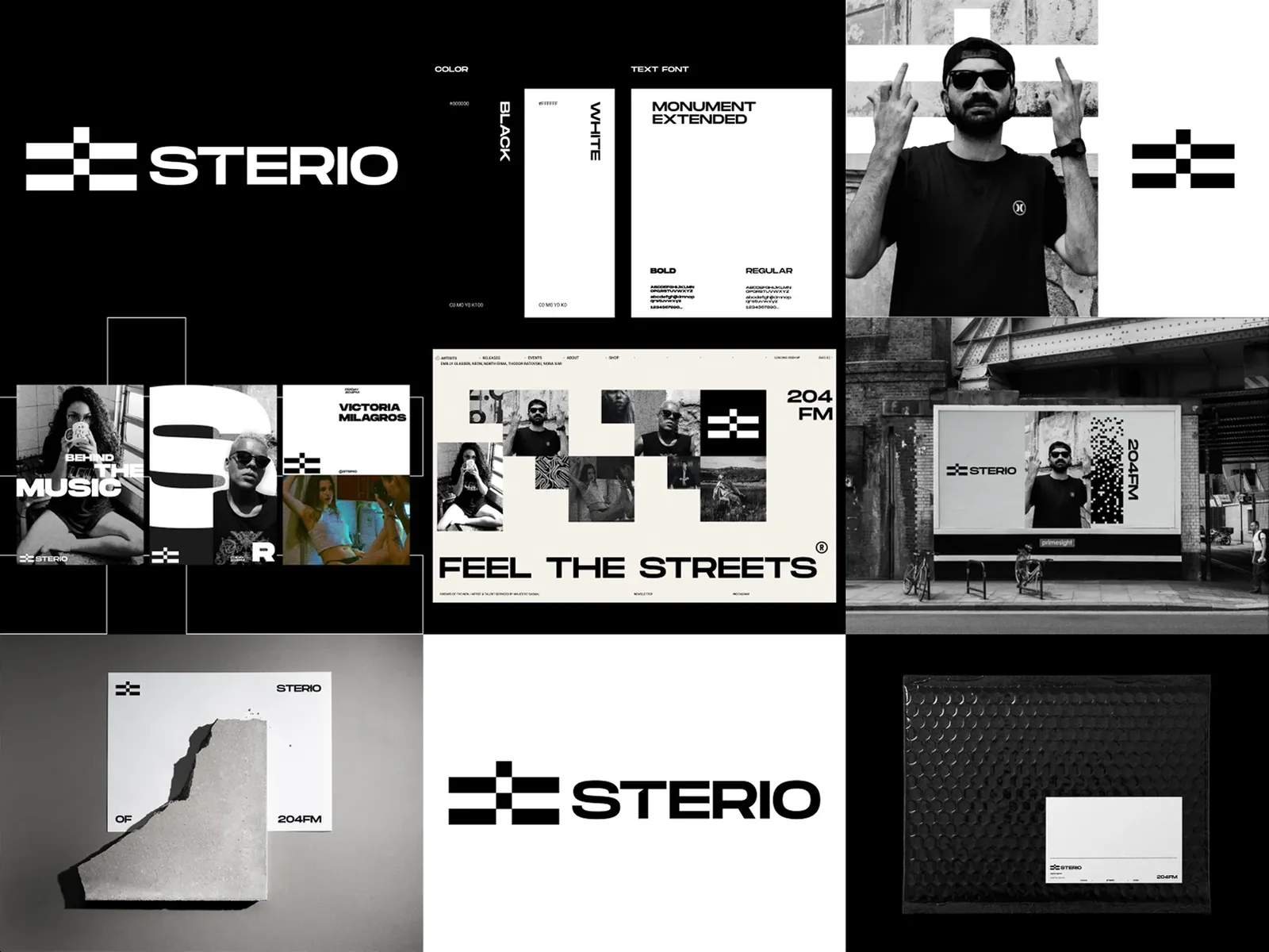
- Wordmark. The brand name drawn as a logo. Great for chest prints, websites and packaging. For STERIO I drew a bold custom wordmark that carries the whole street-culture identity.
- Monogram. One or two initials combined into a compact mark. Perfect for woven labels, trims and caps. Capri's C monogram does exactly this job.
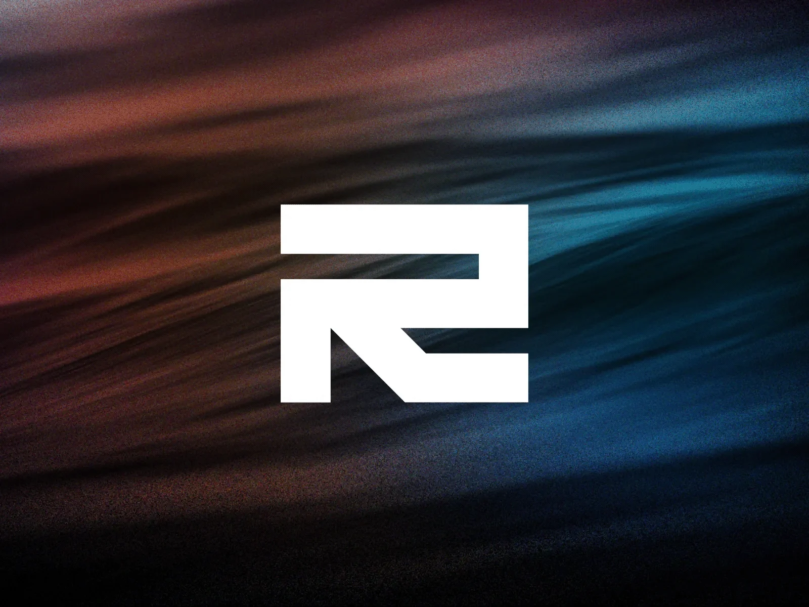
- Symbol. An abstract or pictorial mark. It takes longer to build recognition, but it becomes a graphic people can wear on its own. Retake combines the letter R with an arrow, and that symbol went straight onto apparel graphics.
- Badge or emblem. The name inside a shape, like a patch, stamp or seal. It works well for heritage, workwear and sports-inspired labels.
If you're unsure where to start, a strong wordmark plus a simple monogram covers almost every application a new label needs.
Step 1: Start with the scene, not the font menu
Before any sketching, write down three things: the culture you come from, the people you make clothes for and the attitude of the brand in one sentence. Skate, hip-hop, rave, football terraces, Japanese minimalism and Y2K internet culture all lead to very different letterforms.
Capri is built on the loud, playful energy of 1980s streetwear, so the custom wordmark and the rotating circular type system had to answer to that reference. When the reference is clear, design decisions get easier and the result feels authentic instead of borrowed. I go deeper on this in Streetwear Branding: How to Brand a Streetwear Label.
Step 2: Know the clichés, then avoid them
Look at the brands you'll sit next to on a rack or in a feed. You'll quickly see the shortcuts everyone uses: dripping letters, generic blackletter, a lone initial in a circle, the same trending display font. Using them makes a new label look like a template.
You don't have to avoid every reference. You have to use it with intent and add something only you would do, whether that's a custom letter, an unusual proportion or a detail that tells your story.
Step 3: Sketch wide before you go deep
Explore many directions quickly, on paper or in rough vector shapes, before polishing anything. Try the name in different styles, play with initials, test symbols that hint at your story and look at how each idea would sit on a garment.
Then narrow down to two or three routes and develop each one properly. This is also the stage to write a good brief if you're working with a designer: a clear brief saves rounds of guessing.
Step 4: Design for production, not just for the screen
This is where most clothing logos fail. A mark that looks perfect at full size on a laptop can fall apart on fabric. Check each route against real production methods:
- Screen printing: solid shapes and confident strokes print best. Very fine gradients need a halftone treatment.
- Embroidery: thin lines and small text tend to disappear or blur, so you often need a simplified version with thicker strokes and fewer details.
- Woven labels: the weave is coarse, so compact marks like monograms work better than long wordmarks.
- Small sizes: neck prints, zipper pulls, buttons and social avatars need a tiny mark that stays readable.
- One colour: your logo must work in a single colour, because much of your merchandise and packaging will be printed that way.
Step 5: Build a small logo system
One logo can't do every job. A simple system usually includes:
- A primary logo for chest prints, the website and packaging.
- A secondary mark or monogram for caps, labels, trims and the social avatar.
- A small mark or stamp for neck prints, details and tiny sizes.
- Clear spacing and colour rules so every supplier uses it the same way.
For Capri this meant a custom wordmark, a C monogram for woven labels and a circular type system that wraps around imagery like a stamp. Each piece has its own job, so the brand stays recognisable at every size. The idea behind this is covered in The Quiet Work Behind a Strong Brand System.
Step 6: Test on real products before you decide
Put every finalist on mockups of the products you'll actually sell: a heavyweight tee, a hoodie, a cap, a woven label, a hang tag, a mailer bag and an Instagram profile picture. Look at them small, large and in one colour.
Better still, order a sample print and a sample embroidery of the strongest route. A single physical sample often tells you more than days of screen reviews.
Step 7: Get the right files and protect the name
A finished logo should come with a proper file package:
- Vector files (SVG, PDF, AI or EPS) for printers, embroiderers and label makers.
- PNG files with transparent backgrounds for web and social.
- Colour, black and white versions of every mark.
- A short guideline showing spacing, minimum sizes and colours.
Before you print thousands of garments, check that the name and logo are available to use in your market. A trademark search and advice from a trademark attorney is worth it for any label you plan to grow.
Common streetwear logo mistakes
- Designing only for the screen. Always test print, embroidery and small sizes.
- Following this year's trend. Trend-led logos date quickly. Build a timeless core mark and let the trends live in your graphics.
- Too much detail. If you can't draw it from memory, it's probably too complex.
- Unlicensed fonts. Check that any typeface used in your logo has a licence that covers logo and merchandise use.
- No system. A single logo forces you to stretch it into places it was never designed for.
Frequently asked questions
How much does a streetwear logo cost?
It depends on scope: a single wordmark is a different job from a full system with a monogram, small mark and guidelines. My guide to brand identity costs explains what drives the price, and you can ask me for a quote.
Can I use a font for my clothing brand logo?
Yes, many great wordmarks start from a typeface. Check the licence covers logo and merchandise use, and consider customising a few letters so the mark is more ownable.
Should my clothing brand logo be a symbol or a wordmark?
Most new labels should start with a strong wordmark plus a monogram. A standalone symbol takes time and repetition to become recognisable, so it works best once people know your name.
What file formats do I need for printing on clothing?
Vector files (SVG, PDF, AI or EPS) for screen printing, embroidery and labels, plus PNG files for web and social. Printers and embroiderers will usually ask for vectors.
Do you design logos for streetwear brands?
Yes. I design streetwear logos and clothing brand identities, from the first mark to labels, graphics and drop pages. See also my logo design service.

Rinor Rama — independent brand designer and creative director in New York with 13+ years of experience. Collaborations include Nike, Microsoft, Google, Brent Faiyaz and Don Toliver.Behance · Dribbble · LinkedIn · X
(Related work)
Seen in practice.




Tell me what you're building — I'd love to help.
Rinor RamaBrand designer & creative director
Contact